React components list
This page contains description of all custom created React components included in Fictionlab documentation as well as links to useful Docusaurus components.
Recommended Docusaurus components
ImageZoom
Component for adding photos. ImageZoom is included by default and does not
require importing.
Basic usage:
<ImageZoom
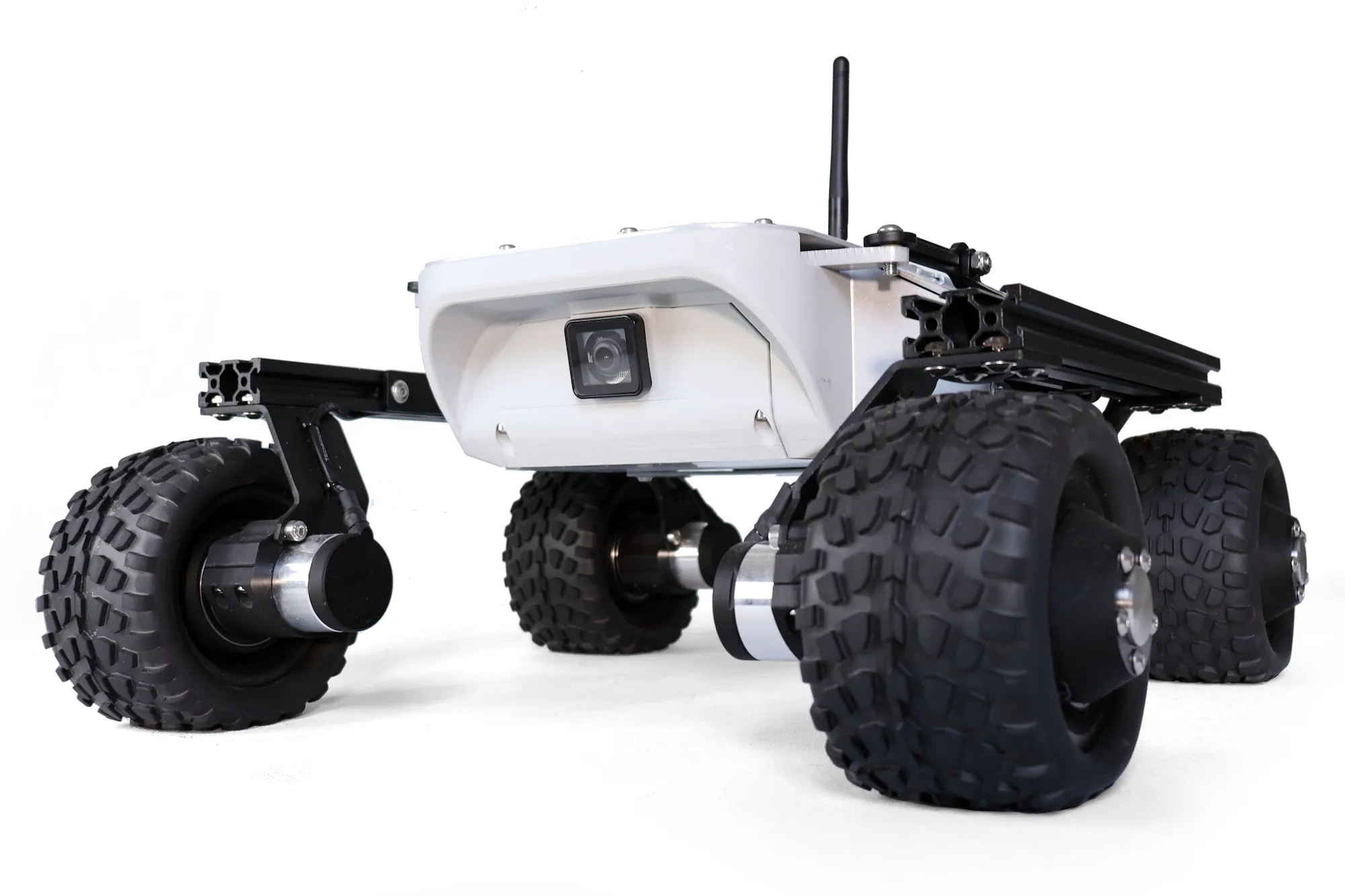
  src="/img/robots/leo/1.8/leo-rover.webp" // image path
  alt="Leo Rover 1.8" // alternative text (if image cannot be displayed)
  width="1000" // real image width
  height="1000" // real image height
/>
Optional arguments
loading="lazy|eager"
By default, lazy loading is applied to all images. While beneficial for
non-visible images during page loading, it may not be suitable for visible ones.
To disable lazy loading for specific images, add the loading="eager" attribute
before the src attribute.
figStyle={{ css }}
This attribute is utilized for custom styling of the figure that contains the
image. It enables adjustments such as resizing the rendered width of the image.
For CSS options and guidance, refer to the
W3Schools CSS tutorial.
Example:
  figStyle={{
    width: 400, // height is automatically adjusted
  }}
allowZoom={true|false}
Determines whether the image is zoomable or not. Defaults to true.
caption="description of the image"
Specifies the caption positioned below the image.
ImageZoom example
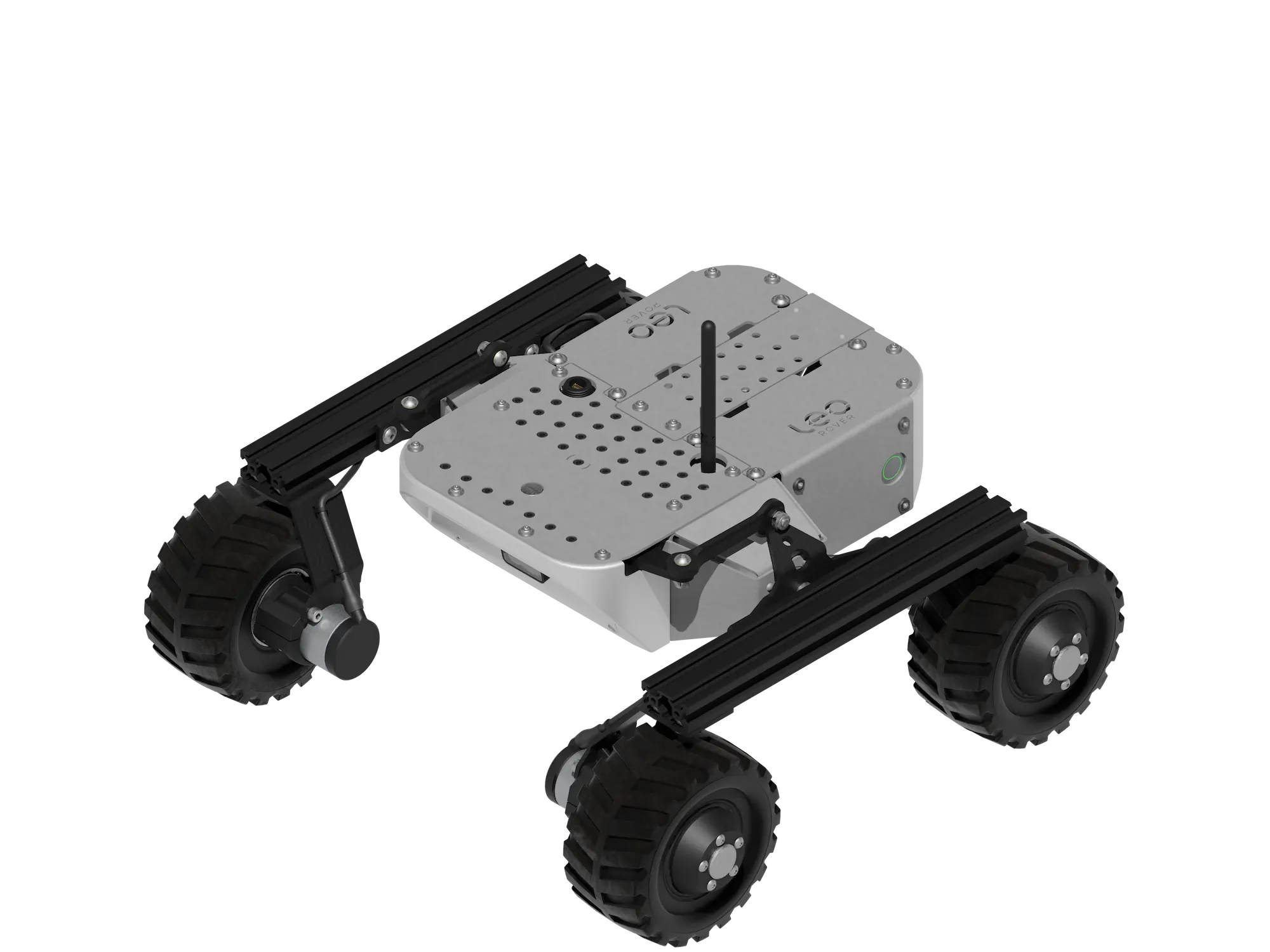
<ImageZoom
  loading="eager"
  src="/img/robots/leo/1.8/leo-rover.webp"
  alt="Leo Rover 1.8"
  width="1000"
  height="1000"
  figStyle={{
    width: 400,
  }}
  allowZoom={false}
  caption="Leo Rover render"
/>
Is rendered:
ThemedImageZoom
Modified ImageZoom component that provides the capability to alter images
based on the theme of the site. It is not included by default and therefore
requires importing.
import useBaseUrl from '@docusaurus/useBaseUrl';
import ThemedImageZoom from '@site/src/components/ThemedImageZoom';
Basic usage:
<ThemedImageZoom
  sources={{
    light: useBaseUrl('/img/robots/leo/1.8/leo-half-contour-light.webp'), // image for light theme
    dark: useBaseUrl('/img/robots/leo/1.8/leo-half-contour-dark.webp'), // image for dark theme
  }}
  alt="Leo rover 1.8 half contour image" // alternative text for both images
  width="2300" // real width of the images
  height="2400" // real height of the images
/>
It accepts the same optional arguments as ImageZoom. Refer to
ImageZoom optional arguments. These arguments apply to
both light and dark mode images.
Both images used in the ThemedImageZoom should have the same size and present
the same content, with appearance adjusted for the selected theme.
ThemedImageZoom example
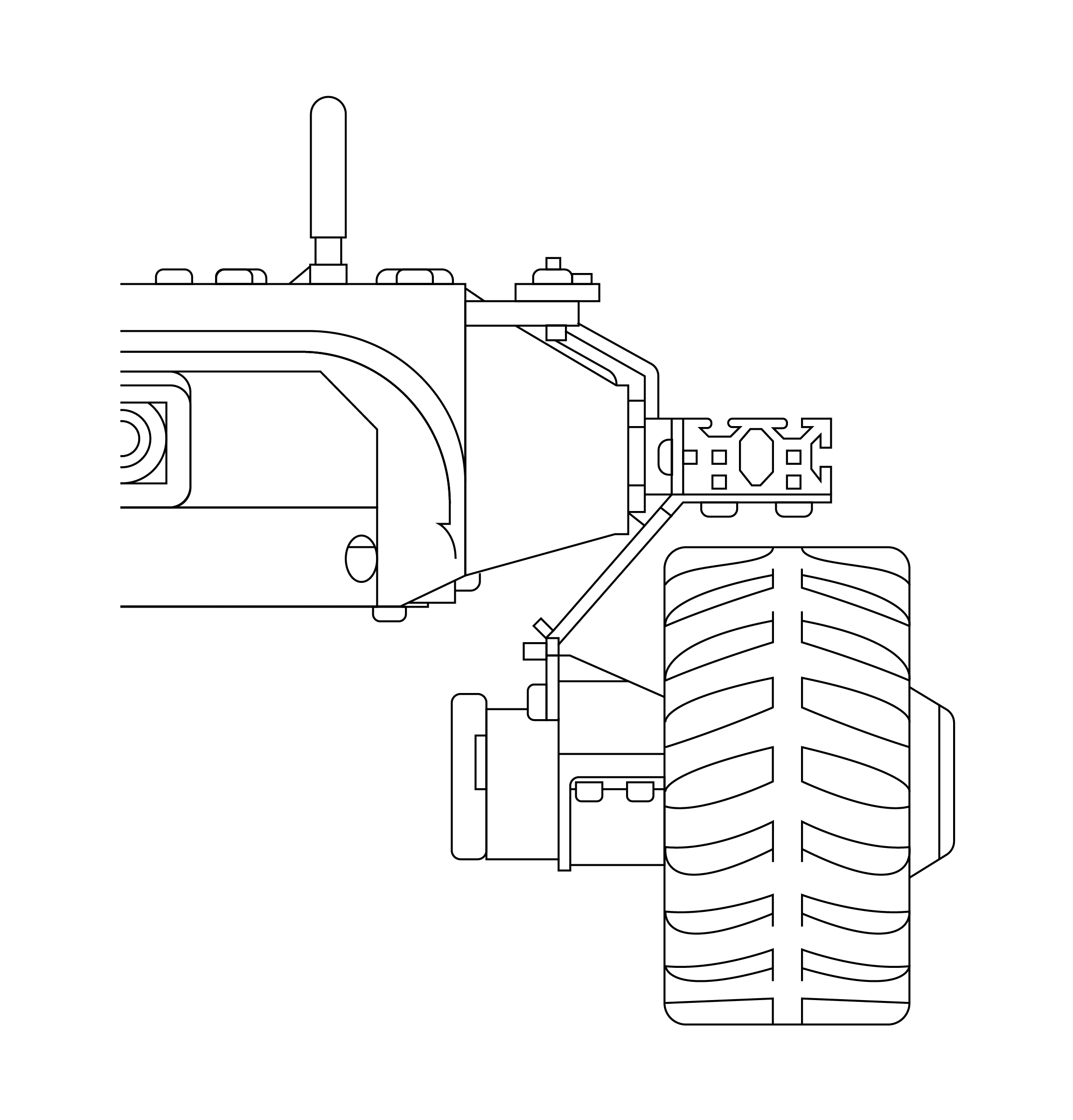
<ThemedImageZoom
  sources={{
    light: useBaseUrl('/img/robots/leo/1.8/leo-half-contour-light.webp'),
    dark: useBaseUrl('/img/robots/leo/1.8/leo-half-contour-dark.webp'),
  }}
  alt="Leo rover 1.8 half contour image"
  width="2300"
  height="2400"
  caption="Leo Rover contour image"
  figStyle={{
    width: 300,
  }}
/>
Is rendered (use mode switcher on the navbar):

LinkButton
The component facilitates the addition of buttons directing to internal or
external pages. The LinkButton is integrated by default and does not require
importing.
The usage of this component varies based on whether the page is located within current sidebar or not.
Automatic links
For pages included in the current sidebar (regardless of their depth in the
structure), it is necessary to specify the docId of the selected page. To
understand how Docusaurus specifies ID of documents, see:
Document ID - docusaurus.io.
Example usage
<LinkButton docId="guidelines" />
Is rendered:
Due to Docusaurus limitations, this method can only link to pages within the currently selected sidebar (i.e., pages visible on the left). To link to pages located beyond this sidebar, please refer to Manual links.
For instance, this page cannot link to pages in the Leo Rover category.
Manual links
When employing LinkButton to link external pages or pages outside the current
sidebar, it is essential to provide additional arguments since Docusaurus itself
cannot retrieve them.
Basic usage:
<LinkButton url="https://leorover.tech" title="Link title" />
Arguments
url="link_url"
The link provided can be either relative (e.g.,
/leo-rover/documentation/docusaurus ) or absolute ( e.g.,
https://leorover.tech ).
title="link title"
Title of the link.
description="description of the link"
Description of the link, put below the title.
icon="🤖"
An optional custom icon placed alongside the title. When used in manual mode,
LinkButton automatically detects the link type. By default, emojis are:
📄for pages🗃️for categories🔗for external links
Example usage
<LinkButton
  url="https://leorover.tech"
  title="Link title"
  description="Some description."
  icon="🏠"
/>
Is rendered:
FlexTable
FlexTable is simple component that renders flex container with designated
layout. It is not included by default and therefore requires importing.
import FlexTable from '@site/src/components/FlexTable';
import FlexTableItem from '@site/src/components/FlexTableItem';
By default FlexTable is styled to have 2 columns on the desktop and 1 column
on the mobile devices.
Basic usage:
<FlexTable>
  <FlexTableItem>Column 1 content</FlexTableItem>
  <FlexTableItem>Column 2 content</FlexTableItem>
</FlexTable>
FlexTable arguments
style={{ css }}
This argument can override default CSS styles and for example allow different
alignment of the items. For CSS options and guidance, refer to the
W3Schools CSS tutorial.
Example:
style={{
  alignContent: 'center',
  justifyContent: 'space-evenly',
  alignItems: 'center'
}}
FlexTableItem arguments
style={{ css }}
The FlexTableItem can also be styled using the style argument, allowing for
different styles for each item or adjusting item width to accommodate more
columns.
mobileColumns={1|2} optional, default 1
Used to specify how many columns will be displayed next to each other on mobile
devices.
FlexTable example
<FlexTable style={{ alignContent: 'center' }}>
  <FlexTableItem
    style={{
      width: '30%',
    }}
  >
    Column 1 content
  </FlexTableItem>
  <FlexTableItem
    style={{
      textAlign: 'center',
      width: '30%',
    }}
  >
    Column 2 content
  </FlexTableItem>
  <FlexTableItem
    style={{
      textAlign: 'right',
      width: '30%',
    }}
  >
    Column 3 content
  </FlexTableItem>
</FlexTable>
Is rendered:
Column 1 content
Column 2 content
Column 3 content
FusionEmbed
FusionEmbed is a component designed to embed Autodesk Fusion CAD models into
the page. It loads the CAD model only after the user requests it by clicking a
link, thereby improving page load speed.
It is not loaded by default, therefore it requires importing:
import FusionEmbed from '@site/src/components/FusionEmbed';
Basic usage:
<FusionEmbed
  url="https://kellideas.autodesk360.com/shares/public/SH512d4QTec90decfa6e0b1bf29fda603dd6" \\ link to CAD model
  embedTitle="Leo Rover 3D model" \\ iframe name
/>
FusionEmbed arguments
url="cad_model_url"
Link to Fusion CAD model. It has to be in kellideas.autodesk360.com domain.
embedTitle="cad model description"
Embedded CAD model description. Used mostly by browser bots (SEO).
loading="lazy" | "eager" optional, default lazy
Define if overlay image should be lazy loaded or not. CAD model image should be
eager loaded if it is in the user's initial viewport (visible during page
loading). Otherwise it should be lazy loaded.
img="image_path" optional, by default cube is displayed \
An image displayed as the background if the user has not clicked to load the 3D model. It is hidden when the model is loaded. It is recommended to set this image as a preview to indicate which model will be shown after loading.
alt="alternative text" required if img is set
Alternative text shown if image cannot be displayed.
img_width={number} required if img is set
img_height={number} required if img is set
Real dimensions of the image in pixels.
Right now it is not possible to style this component using CSS.
FusionEmbed example
<FusionEmbed
  url="https://kellideas.autodesk360.com/shares/public/SH512d4QTec90decfa6e0b1bf29fda603dd6"
  embedTitle="Leo Rover 3D model"
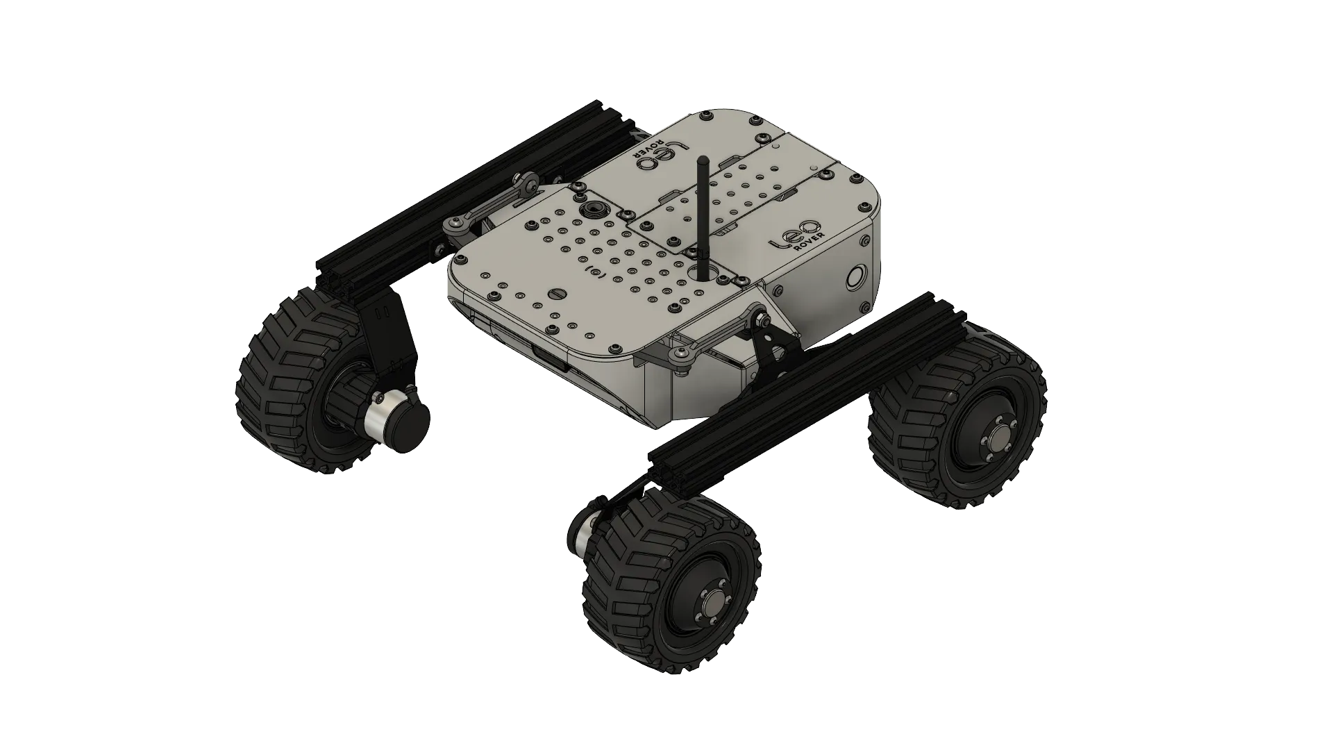
  img="/img/robots/leo/1.8/leo-1.8-cad.webp"
  alt="Isometric Leo Rover 3D model view"
  img_width={1920}
  img_height={1080}
/>
Is rendered:
ProductPreview
ProductPreview is a component designed to display visually appealing links to
https://shop.leorover.tech. It is useful for linking addons that assist in
integrating desired sensors, linking products on their specification pages, and
more.
ProductPreview is not imported by default, thereby requires importing.
import ProductPreview from '@site/src/components/ProductPreview';
Basic usage:
<ProductPreview
  shopUrl="https://www.leorover.tech/shop/leo-rover-developer-kit-2"
  imageSrc="/img/robots/leo/1.8/leo-rover-shop.webp"
  width={2000}
  height={1333}
  title="Leo Rover Developer Kit v. 1.8"
  description="In this construction kit, the small Leo Rover mobile robot contains
    all, from A to Z. The Leo Rover Developer Kit allows you to assemble the robot's
    essential components."
/>
ProductPreview arguments
shopUrl="link_to_product_page" required
Link to product page on leorover.tech
loading="lazy" | "eager" optional, default lazy
Define if product image should be lazy loaded or not. Image should be eager
loaded if it is in the user's initial viewport (visible during page loading).
Otherwise it should be lazy loaded.
imageSrc="image_path" required
An image displayed as a preview of the product. It should be the same image used
as the main image on the product page.
alt="alternative text" required
Alternative text shown if product image cannot be displayed.
width={number} required
height={number} required
Real dimensions of the product image.
title="product title" required
Title of the product. It should follow convention - "Product Name | Leo Rover
shop"
price={number} optional
Product price in EUR.
description="product description" optional
Description of the product.
ProductPreview example
<ProductPreview
  shopUrl="https://www.leorover.tech/shop/leo-rover-developer-kit-2"
  loading="eager"
  imageSrc="/img/robots/leo/1.8/leo-rover-shop.webp"
  width={2000}
  height={1333}
  title="Leo Rover Developer Kit v. 1.8 | Leo Rover shop"
  price={4799}
  description="In this construction kit, the small Leo Rover mobile robot contains
    all, from A to Z. The Leo Rover Developer Kit allows you to assemble the robot's
    essential components."
/>
Is rendered:
